30 Days of
Data Visualization
In 30 days, how many visual insight can you create?
30 Days of Data Visualization is a passion project featuring daily data visualization spending few hours a day to research data, write story, and create visual graphics using anything available to me from coding in Javascript, analyzing data in spreadsheet, composing pixel perfect illustration or creating charts.
covering topics of interest on mobility, healthcare, real estate, environment, education, and economy.

Day 30 Foreign Language Education
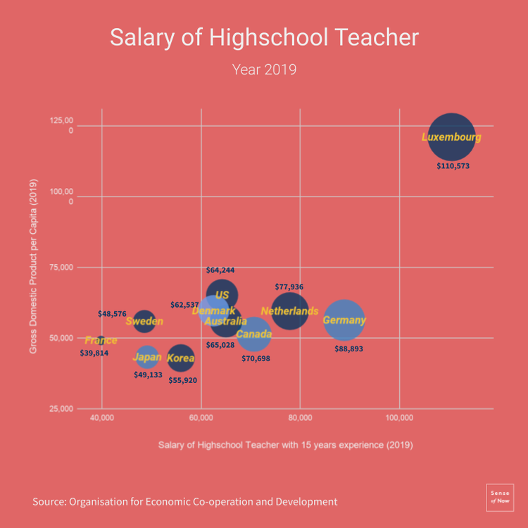
Day 29 Teachers' Salary
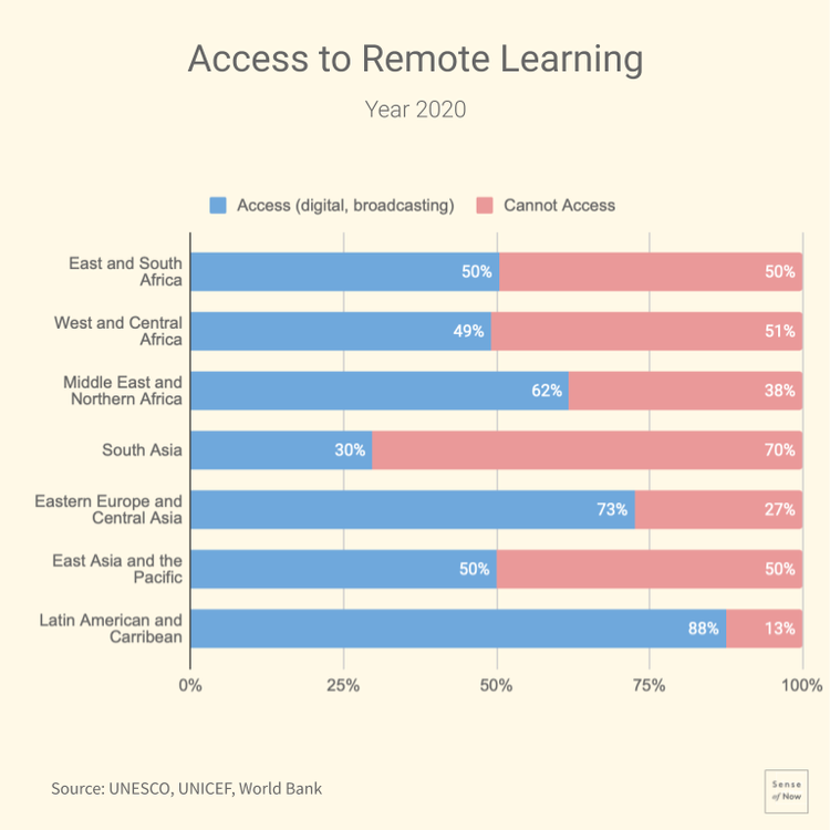
Day 28 Remote Learning

Day 27 Bachelor Degree Tuition

Day 26 STEM Doctor's Degree

Day 25 Art & Culture in GDP
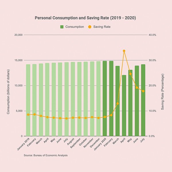
Day 24 Consumption & Savings
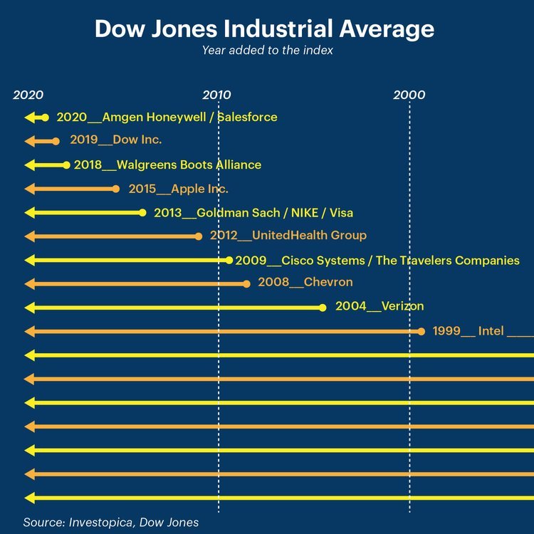
Day 23 Dow Jones Index
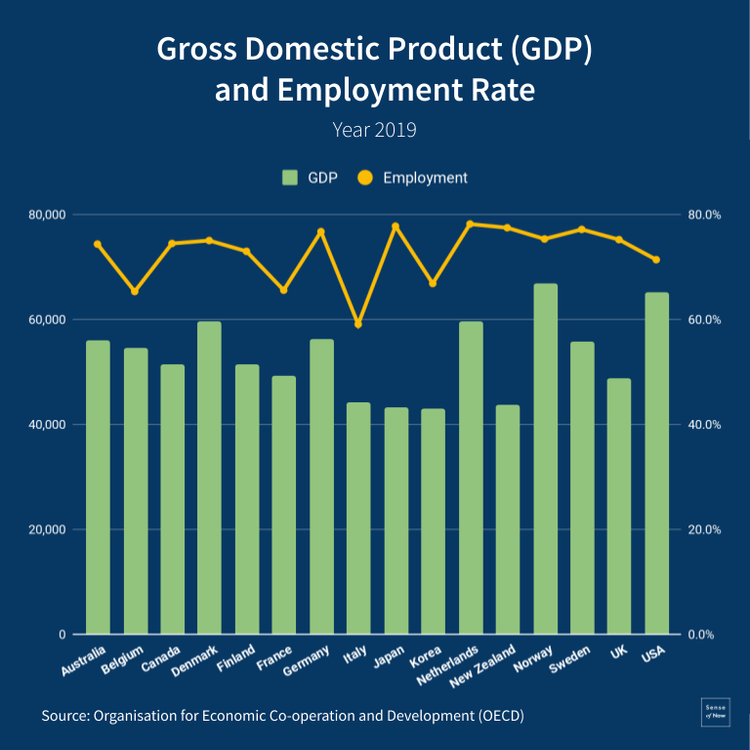
Day 22 GDP and Employment
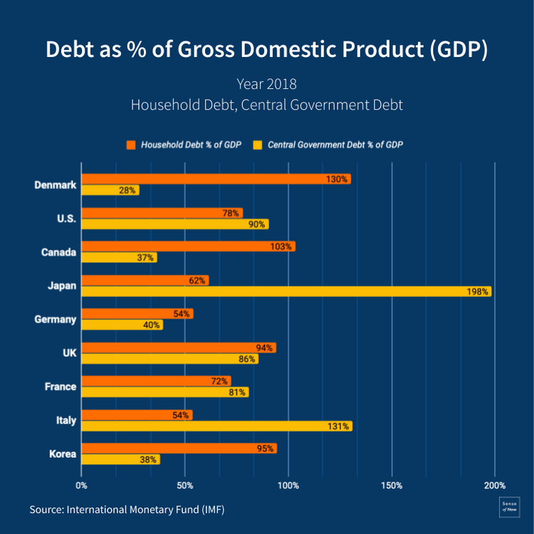
Day 21 Household and Government
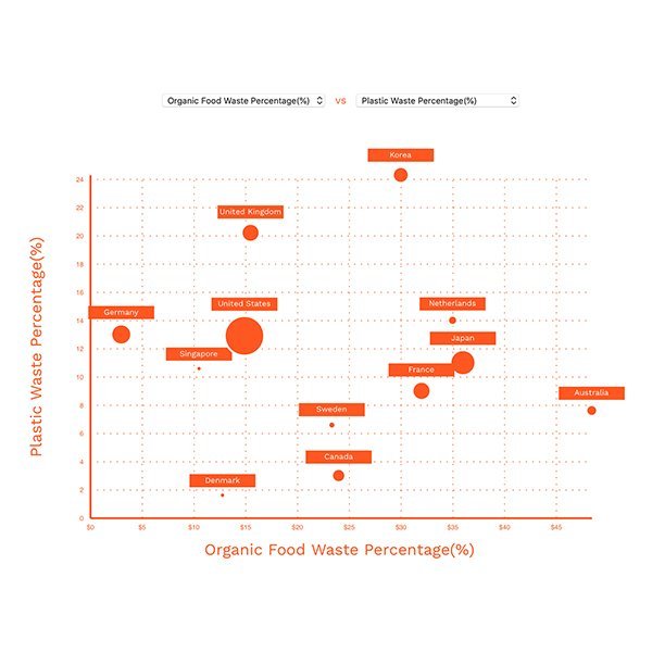
Day 20 Organic Food and Plastics
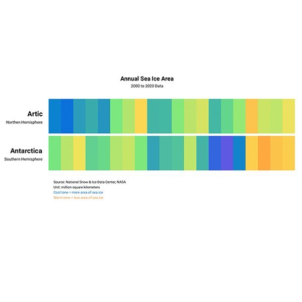
Day 19 Sea Ice Area
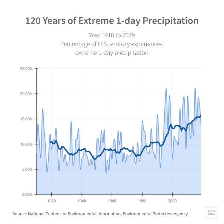
Day 18 Precipitation and Drought
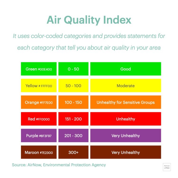
Day 17 Air Quality Index
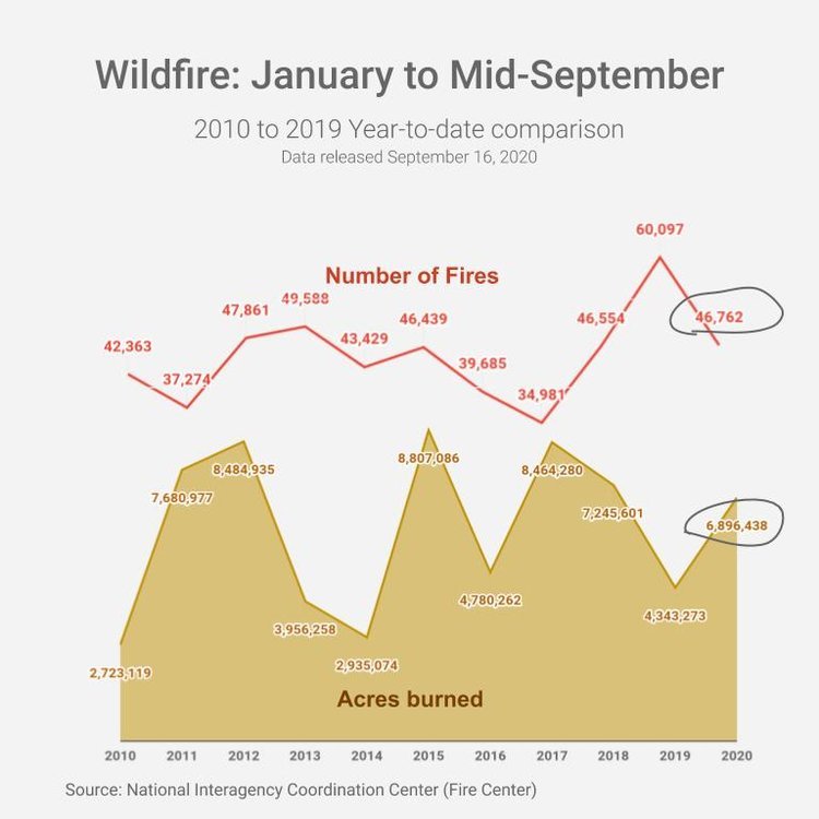
Day 16 Wild Fire
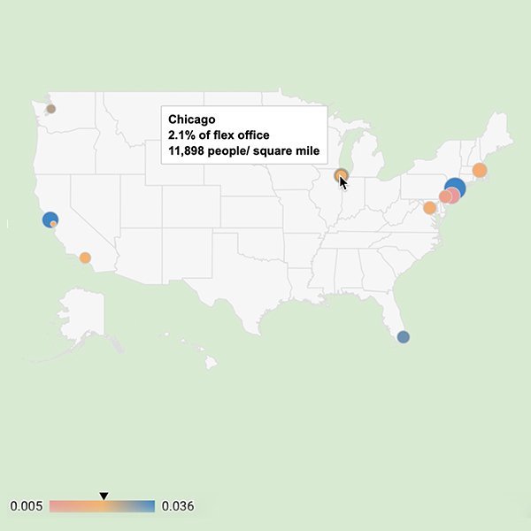
Day 15 Flexible Offices
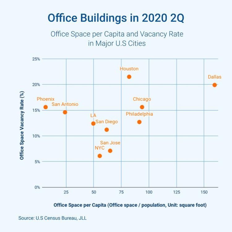
Day 14 Office Buildings
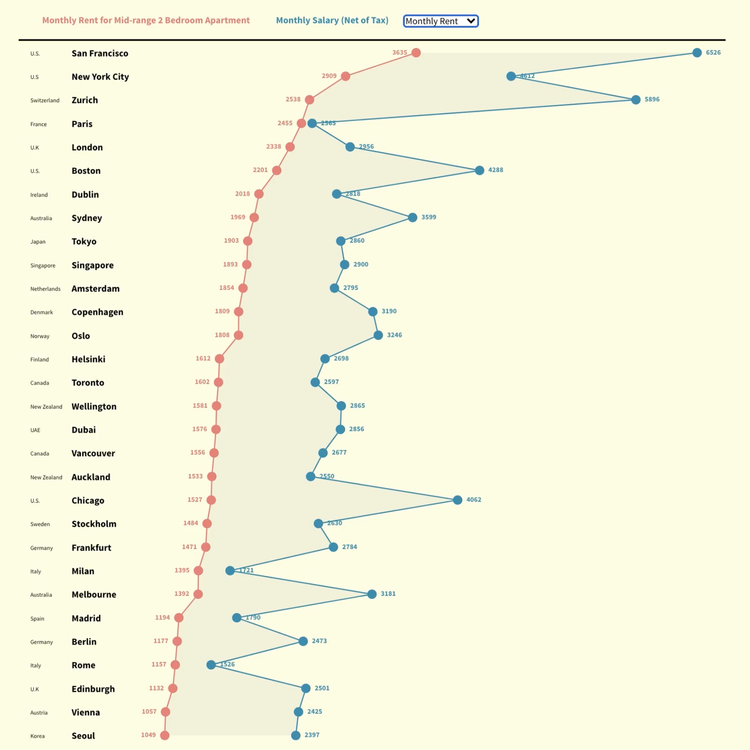
Day 13 Monthly Salary and Rent
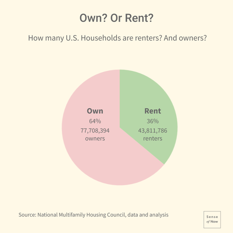
Day 12 Housing Rent & Ownership
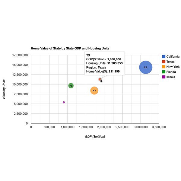
Day 11 State Home Value & GDP
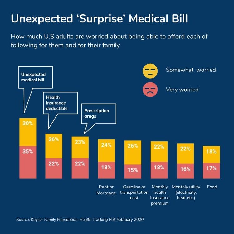
Day 10 Unexpected Medical Bill
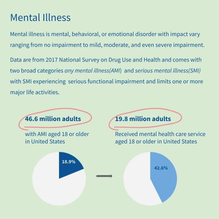
Day 9 Mental Illness
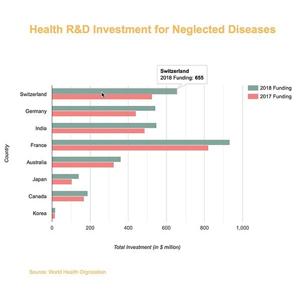
Day 8 Health R&D Investment
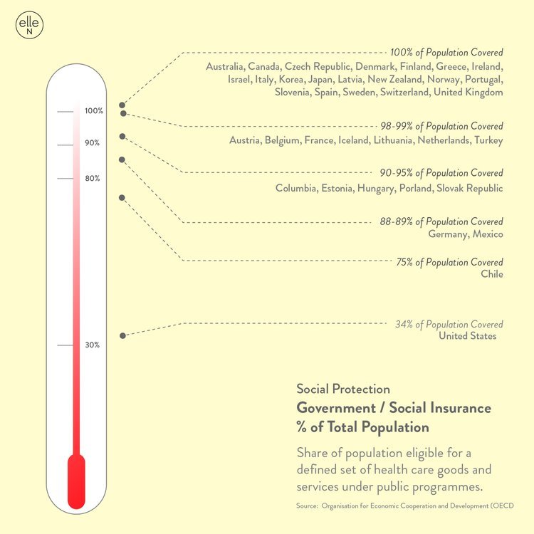
Day 7 Social Protection
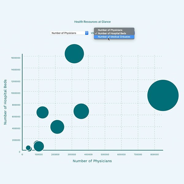
Day 6 Healthcare at Glance *
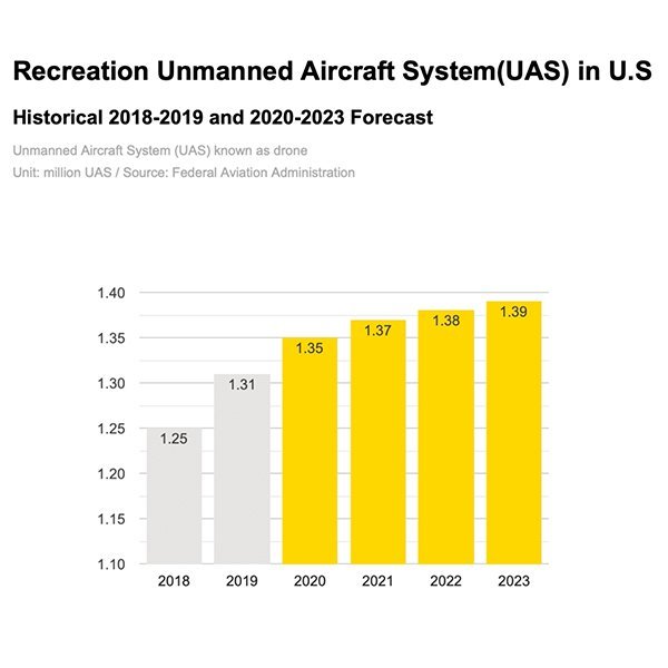
Day 5 Drone Registration *

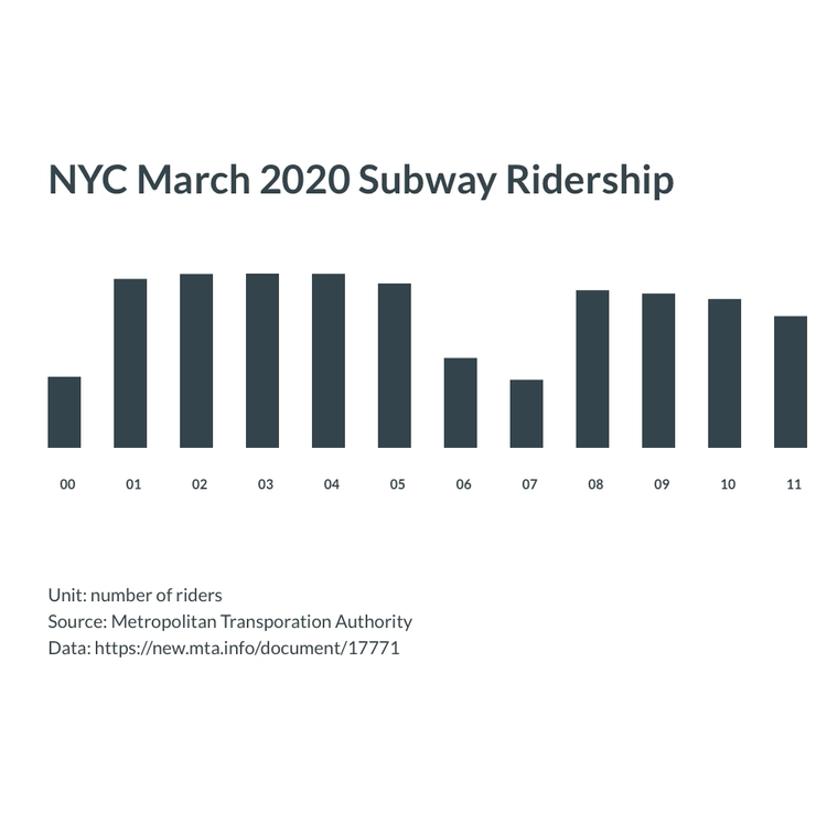
Day 4 Subway Riderships

Day 3 Micromobility Growth *

Day 2 NYC Citi Bike Ridership *
Day 1 NYC Subway Ridership *